REVIEW – This game – and yes, I’m going to say this upfront in the intro – is not recommended to those who loved the first two Project CARS games. They should stay away from it, as it’s not for them, and you might have noticed it in some of the half marketing sentences.
It’s not what the series was meant to be.
Why is it good?
It’s good fun with friends. Need For Speed: Shift’s and Forza’s fans might find it as a solid alternative or consider it as a spiritual successor to the former. It can be played without a serious simulator configuration (steering wheel).
Why is it not good?
Unfortunately, I can’t just get it done by saying that the name of the game is incorrect (I wish it was that easy…). Let’s begin by saying that this game isn’t entirely a simulator game. Instead, it’s more of an arcade racing title, and because of it, multiple facets of the game are lagging behind the first two Project CARS… CARS-s? I’m not saying this because the game has that mobile-ish menu tile layout. No, let’s begin by the fact that the handling’s changed because of the console players.
The physics have become significantly weaker, and I don’t even see tyre wear happen in Slightly Mad Studios’ game (and remember this name because I’m going to come back to it later to fill out the characters). And even if you don’t end up recognizing this thing, and still decide to use manual transmission, you will see how the artificial intelligence flies past you on straights as they will not have to change gears, meaning they don’t lose speed because of it.
Physics or not physics
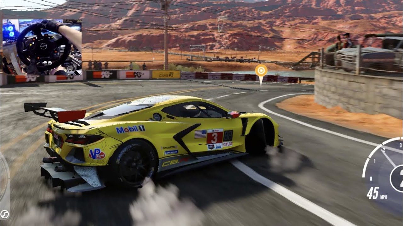
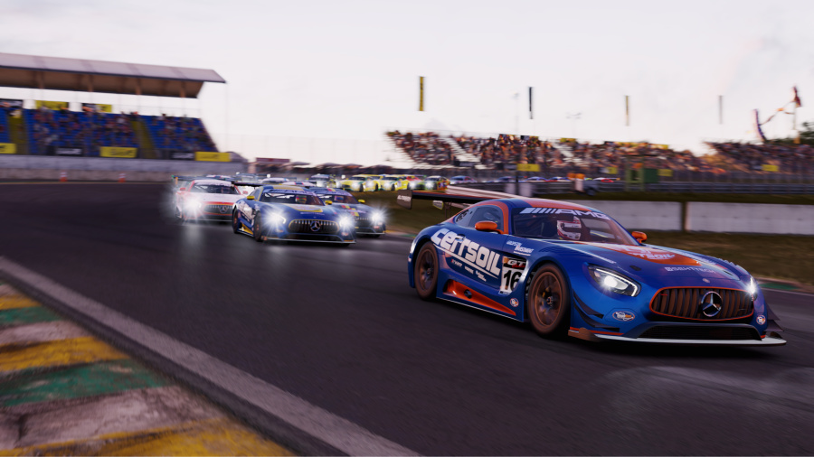
And they also don’t feel like keeping to the rules of physics during the corners either, then again, we also tend to break them now and then. All this, in comparison to Project CARS 1 & 2, are simply incredibly bad. I guess I can say how everything got highly simplified, as there is no such thing as making a pitstop, or seeing your engine wear out over time, and even the damage system looks nothing more than an optical thing, and it simply reminded me of Need For Speed: Prostreet that launched thirteen years ago if I remember correctly. The HUD during the races strongly resemble Forza Horizon, and the gameplay also feels similar to GRID, which is now essentially an in-house competitor.
As there’s no story, here’s the gameplay cycle: you enter a championship, you race, you earn money, you buy a new car. Start from step one. The cars don’t seem to be put in classes properly, and yes, if you play Forza, you will quickly recognize how the devs used its model to give each car a performance score. You can earn experience points while you do the races (once again, taking a cue out of Forza’s book), and after a few minutes – while I also had the usual why am I doing this? thought – I stopped the game and asked myself: what is this, an upscaled mobile game? It looks ugly in my opinion.
Where did these go?
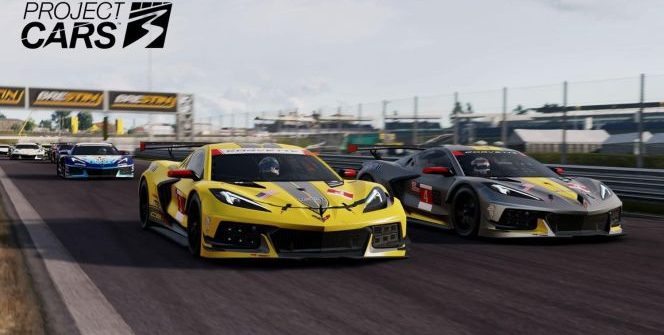
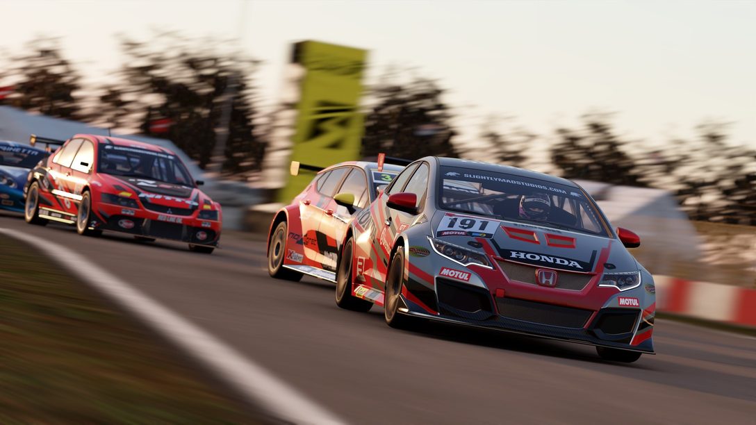
The second one looked much better than this, and I think you can compare the cars from both Project CARS 2 and 3 (most of them are lifted over), and I believe you’d find the former to look better. Visually, the only pro for this game is the time of day changing. Even the audio has evolution backwards, so the dev team that recently released Fast & Furious: Crossroads and was formerly responsible for Need For Speed: Shift, has decided to fall flat on its fat ass between two chairs because CARS is supposed to be Community-Assisted Racing Simulator.
This isn’t a simulator. Sure, you can upgrade your cars (Forza says hi once again…), but you may see a visual upgrade not change anything on your car, and we could thus go as far as saying it is outdated. It might have been a raging success two generations ago, if, IF, the artificial intelligence was balanced out, as you can quickly get away from them in one race, only to get kicked by it in the next one without any chance. So there aren’t just difficulty spikes but a lottery: guess which race will allow you to run away with the victory and which one will provide you a significantly hard time. Something similar was in TOCA Race Driver 3. And that was 14 years ago.
So no
Yes, the previous segment was ONE paragraph (originally at least… it will likely be edited but I don’t care), as I wanted to express how Project CARS 3’s name is not fitting whatsoever. The game should have been released under a different name. And as I said at Fast & Furious: Crossroads: the studio expected this game to flop so they sold themselves to Codemasters – they failed twice in one month, and thus, the studio’s fame has dissipated. The game is not good as a Project CARS game. As an arcade racer, it would make sense. But this name doesn’t justify anything. If you have Forza Horizon 4, then do not buy this. Not even if that game isn’t available on PlayStation 4. This is a DriveClub or an OnRush, nothing more. It’s not a recommended purchase. It’s a Codemasters budget-simcade. Something that we have seen several times.
-V-
Please support our page theGeek.games on Patreon, so we can continue to write you the latest gaming, movie and tech news and reviews as an independent magazine.
Become a Patron!
Pro:
+ Forza Horizon items
+ Time of day changing
+ Can be handled easier
Against:
– This is not Racing
– Deficiencies in physics
– Supid AI
Publisher: BANDAI NAMCO Entertainment
Developer: Slightly Mad Studios
Genre: Racing
Release date: August 25, 2020
Project CARS 3
Gameplay - 7.2
Graphics - 5.8
Physics - 6.6
Music/Audio - 5.9
Ambience - 8
6.7
FAIR
This is Need For Speed Shift 3. Not Project CARS.





Leave a Reply