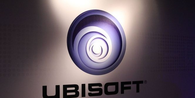
1986, 1995, 2003, 2017 – the French company introduces its fourth logo.
You can see the evolution of Ubisoft‘s logos below. The one used up to now has had a fourteen-year lifespan, but now they replaced it with one that uses a different swirl and font, which, at first glance, looks like a downgrade, just like their games’ visuals from E3 to the retail release.
Ubisoft said the following on their blog: „It all started in 1986 with this rad design – a look inspired by the distinct visual style of the ’80s. At the time, Ubisoft was a local distributor of video games. Nine years later, Rayman was born, and Ubisoft introduced the rainbow. This marked the company’s shift from a distributor to a creator and highlighted the fact that Ubisoft was creating mainly family-oriented content. In 2003, the swirl appeared on the scene and once again signaled a shift. It followed the acquisition of Red Storm and the creation of new Tom Clancy titles, marking a more mature and diversified approach.
Today, we create worlds – worlds that live as video games, comics, movies, TV shows, books, and amusement park rides. Our new logo is minimalist, modern and monochromatic. It’s a window into our worlds, giving a preview of what’s to come by highlighting the artistry that goes into creating them. The swirl and the letter O are both deliberately created to be reminiscent of hand-drawn shapes and represent our human qualities of enthusiasm, curiosity and the grain de folie that Ubisoft is known for.”
SOURCE: Ubisoft







Leave a Reply