Another video has also surfaced, and it perfectly recaps why CD Projekt RED‘s game has caused massive disappointment.
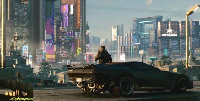
Cyberpunk 2077‘s location is not small (but it could have been bigger… we’ll get back to it later). Night City is not easy to fully explore, and we now got an analysis of it from a different perspective. Morphologis, an architect, runs a YouTube series (called An Architect Reviews) that focuses on spaces inside of digital worlds.
It provides a tour of some of the major spaces in the game, starting with V’s massive housing block (and you can’t buy other apartments, even though CD Projekt RED has previously promised you to have this feature that was included as early as the PS2 Grand Theft Auto games!), which Morphologis compares to some of the 70s Japanese Metabolism movement (this combined the biological growth with megastructures). Other architecture movements get mentioned, too, such as the Brutalism (post-war, 1950s United Kingdom with minimalistic touches), 1930s Asian art-deco, and business architectures. These are all scattered across the city.
The video brings up the idea of oppressive architecture, which means people are cogs in the Cyberpunk machine. As the corporations took over in Night City, the building regulations have slowly vanished, and it allowed the buildings to be skyscrapers and grow over each other while infringing on public space. The roads of Cyberpunk 2077 are somewhat „spaghettified,” interweaving with each other, making the video’s creator claim that it’s „an accurate depiction of what a future city ruled by corporations might look like.”
And the second, 40+ minute video by Crowbcat perfectly shows how even in the weeks before the game’s launch, the PlayStation 4 and the Xbox One owners were fooled (and we can’t even fully discover the city, even though this was yet another promise!). 2018’s 48-minute walkthrough was also dissected. It’s worth watching, as it nicely recaps the events of the past two years.
Source: PCGamer


Leave a Reply